RUBY PH > WORK > COMMERCIAL > CASA DE FLEX
FLEXMAMI
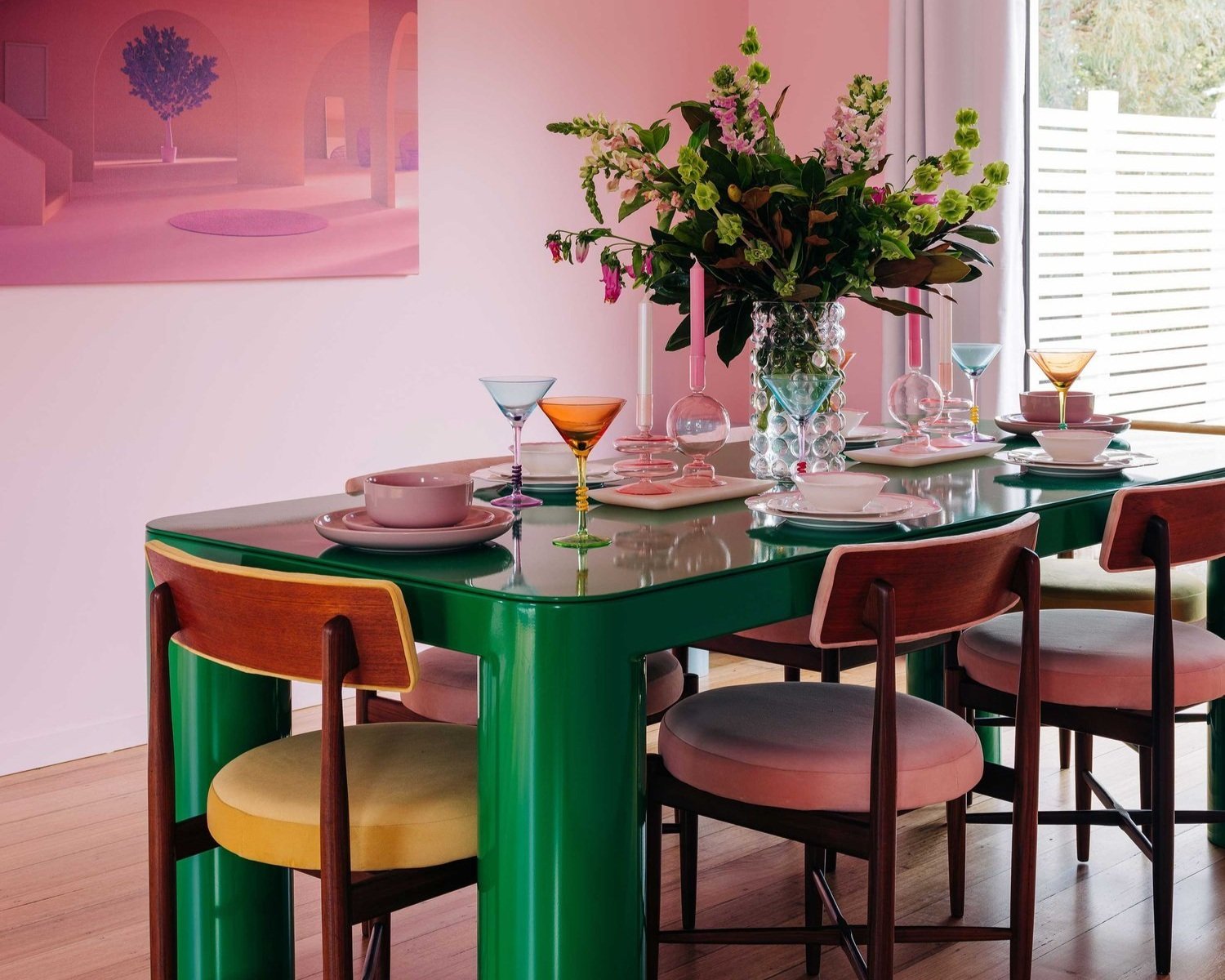
Australian Media Personality Flexmami bought an unassuming weatherboard house in Tasmania and turned it into a colourful, interior design oasis. I created the brand identity to match.
Client Flexmami
Year 2022
Scope Art Direction & Brand Identity
Time 4 Weeks
Assets Brand Identity, branded assets, product & merchandise concepts.
Notes Working on a stylised, interior and tourism brand was really exciting. I wanted to design something that was really visually impactful and deliciously colourful to complement the incredible interiors that Flexmami designed.
Inspired by the gorgeous, sculptural slab of rock guarding the entrance to the home, I designed a simple brand icon that could be used as an anchor, icon and symbol of the rock and the house.
The Rock
The House


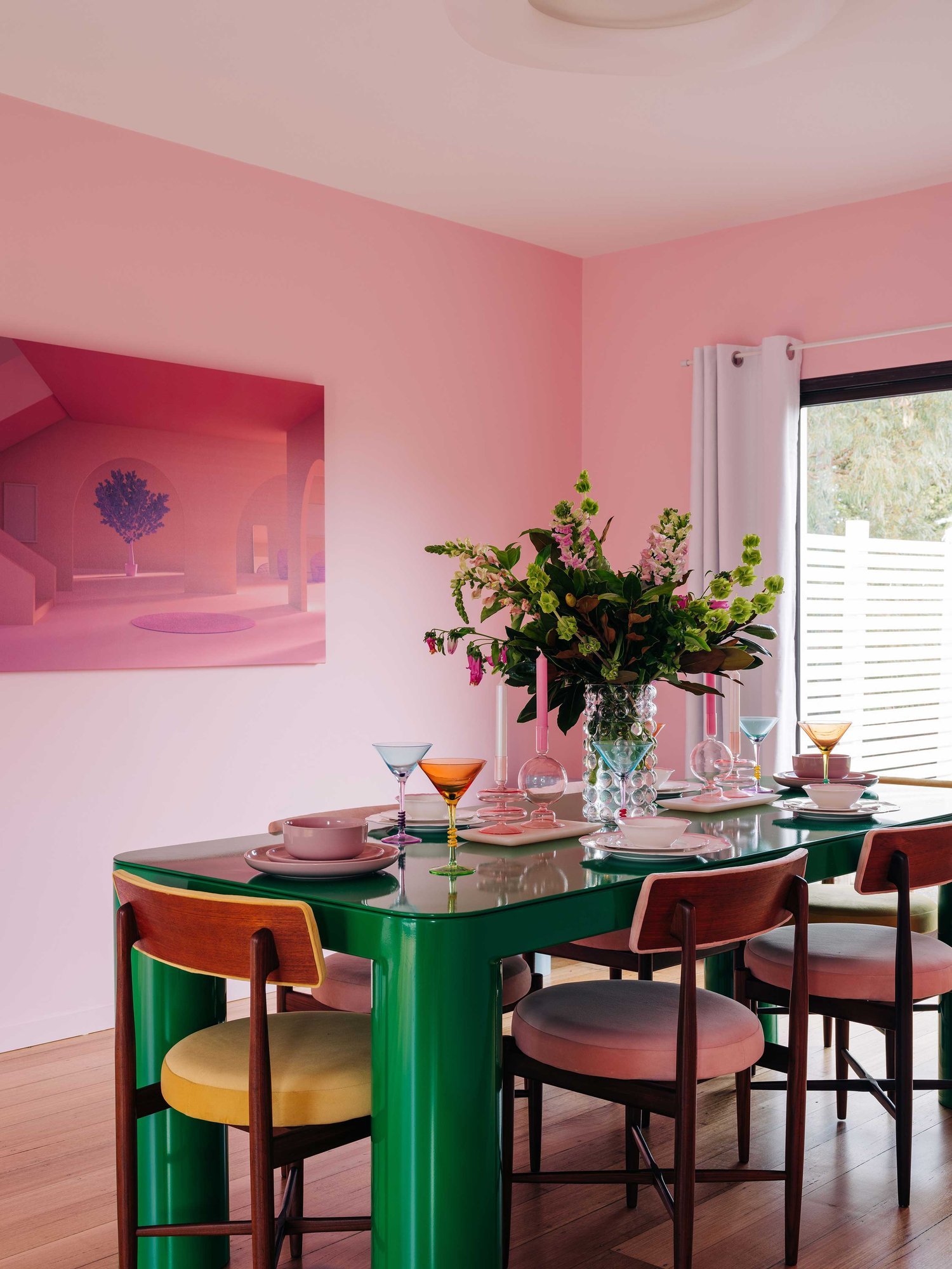


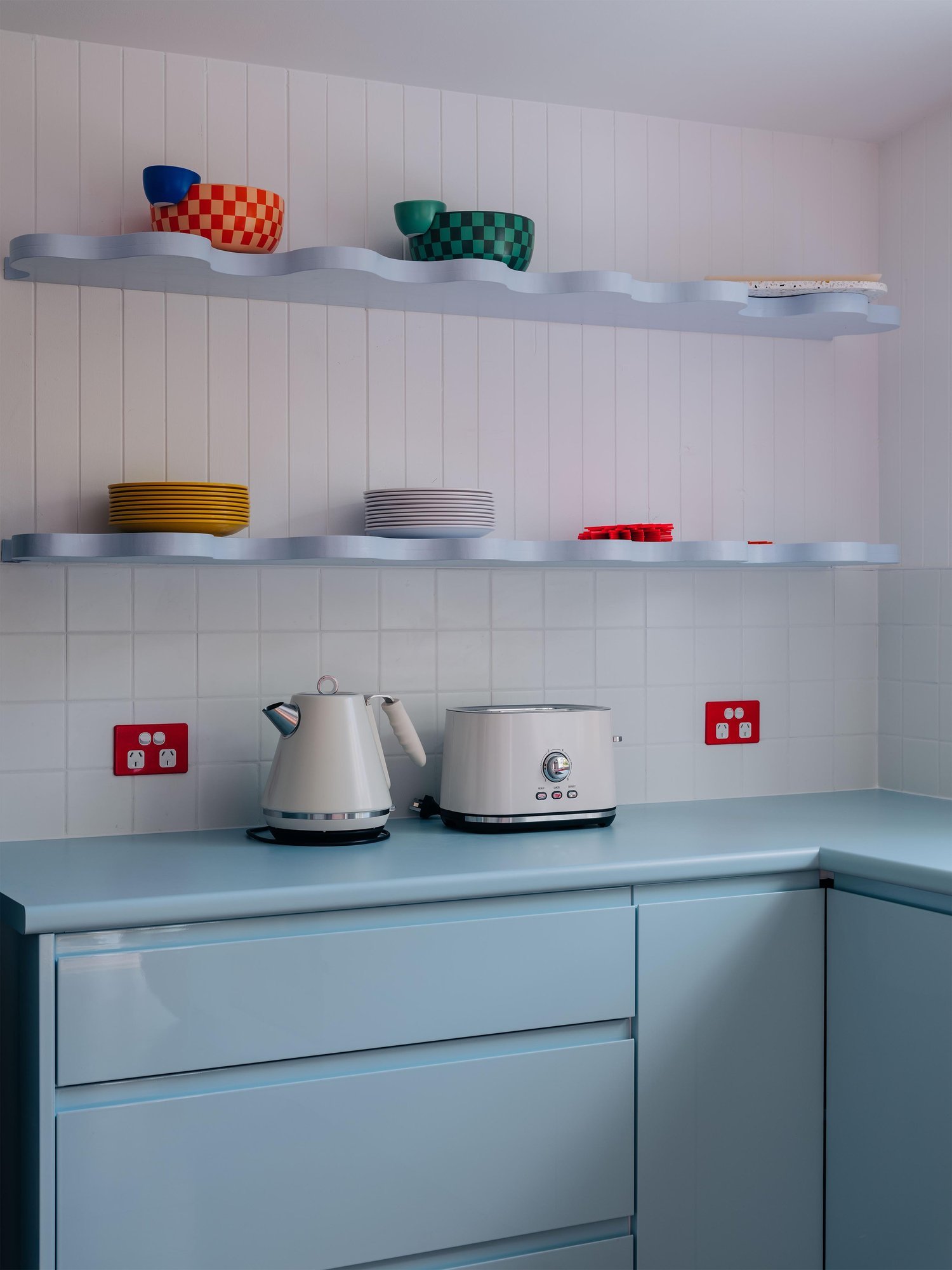


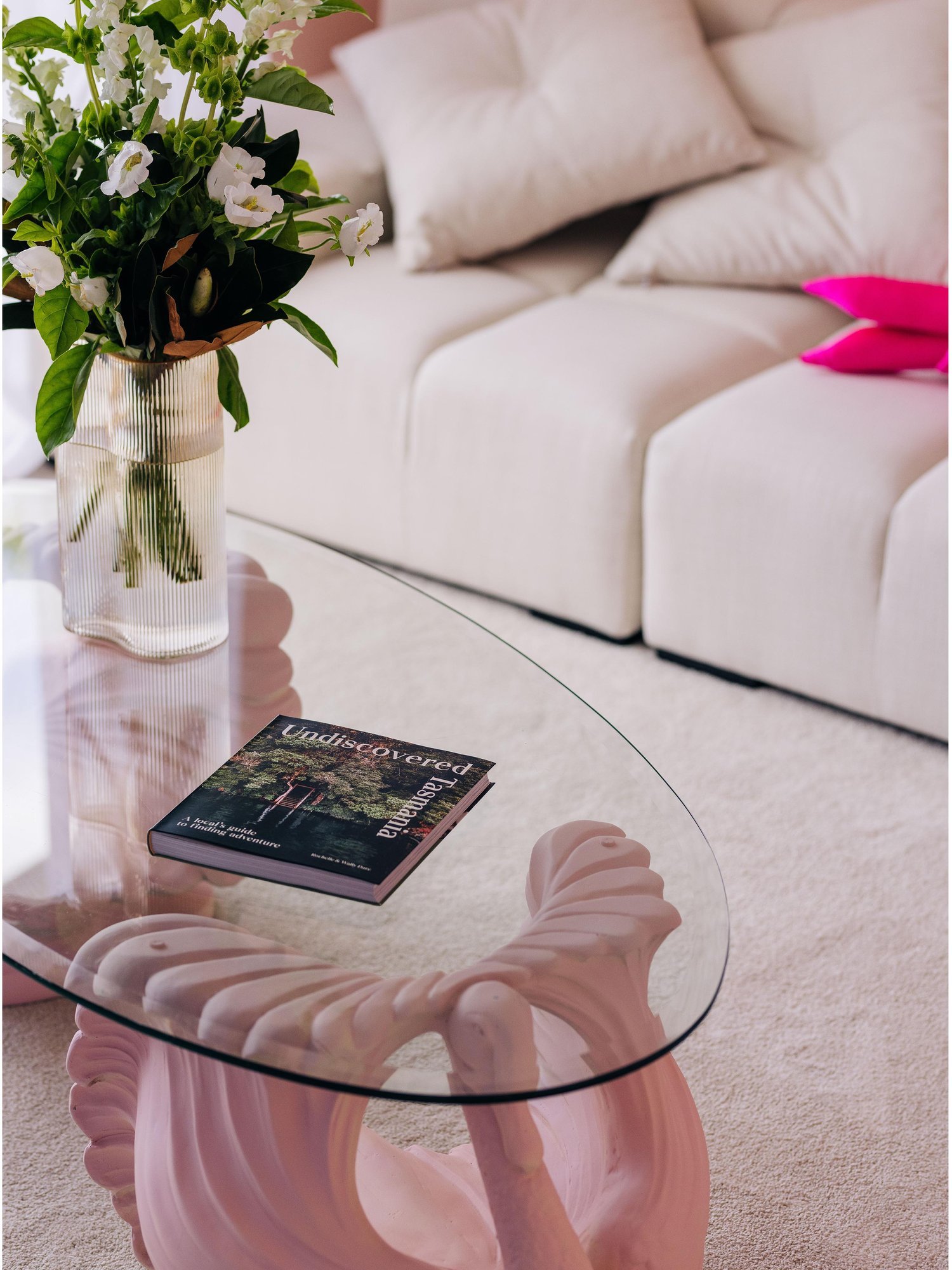


Images courtesy of Casa De Flex
“I’m so. Bloody. Stoked. It was so helpful to see all the initial font and colour iterations before I saw where you landed on a logo mark. I’m so obsessed with the colours. It’s PERFECT! So perfect. So perfect. So perfect.”
— Lillian Ahenkan AKA FlexMami

