RUBY PH > WORK > COMMERCIAL > FLEXWORLD
FLEXWORLD
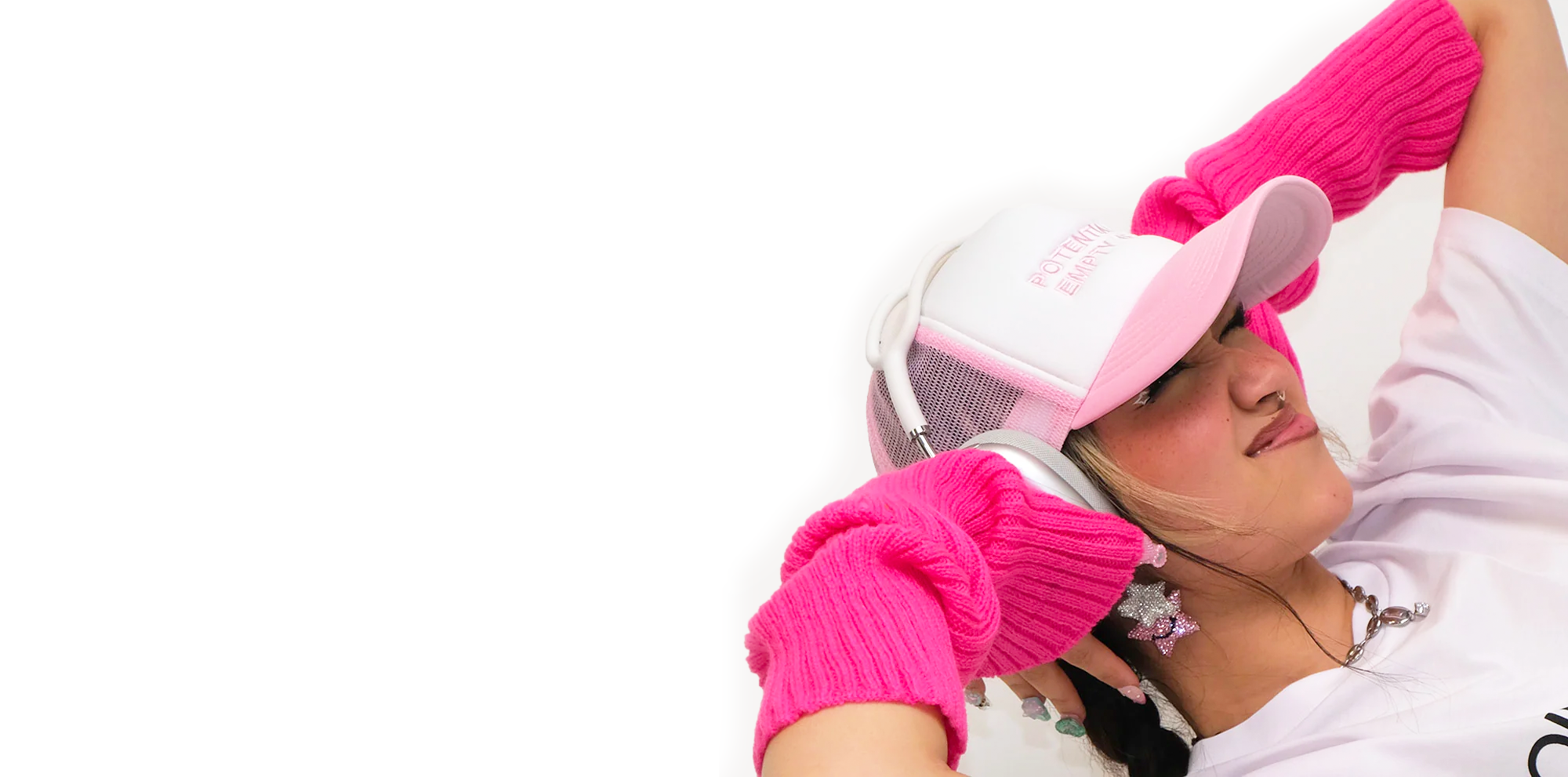
Australian Media Personality FlexMami has grown her business from a solo entrepreneur to developing a parent company with staff who handle her ever growing collection of assets & investments. I named the company and developed the B2B identity that exists beyond “Flex the influencer.”

Client FLEXWORLD for FlexMami
Year 2022
Scope Naming & Tagline, Art Direction & Brand Identity
Time 6 Weeks
Assets Company Name, Tagline, Brand Identity, Branded Assets, Operational Assets, B2B Pitch Decks.
Notes Nothing is more from scratch than naming a company before it even starts. A name can make or break a business. Initially the Flexworld team was hard pressed coming up with something that encapsulated the vibes of the company and the scale at which they were operating. FLEXWORLD was the first thing I pitched and eventually after 100 other names worth of deliberation, we landed back on that.
FLEXWORLD LINKS ASPIRATION
TO REALITY ➔ THROUGH PROJECT BASED COLLABS, EXPERIENCES, PRODUCTS & SERVICES.
TAGLINE
FLEXWORLD encapsulates all the projects that FlexMami has created. Despite not being all about Flex the influencer, we still wanted these projects and startups to still feel part of an overall mission that the parent company seeks to achieve.
This brand identity was inspired by global parent companies that act as a foundation for branded products to exist from. Think Googles “Alphabet” and Justin Hemmes’ Merivale.

Early web concept for the brand.
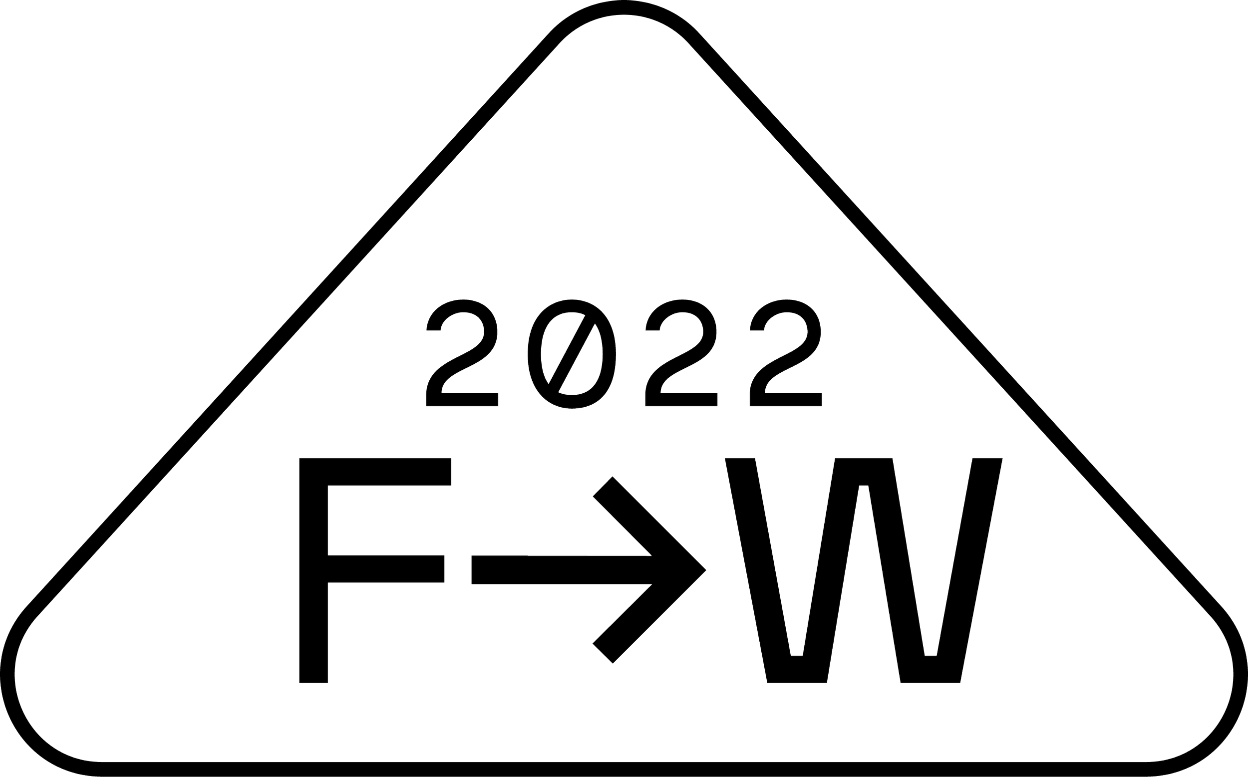


Shields
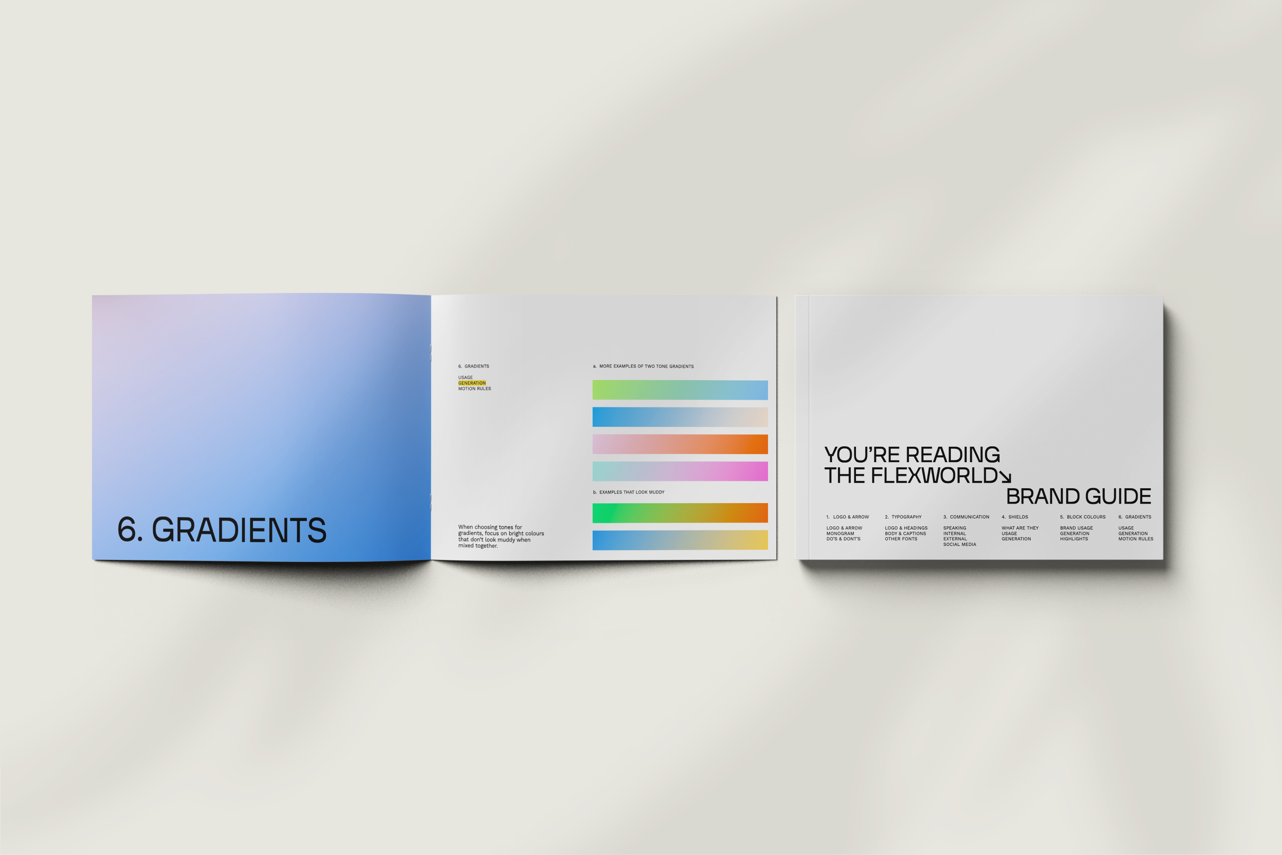
BRAND GUIDE
While designing the FLEXWORLD brand, I also built a comprehensive, future proof brand use guide for the team. As non-designers, it was critical for them to have access to a collection of readymade assets as well as a detailed reference manual that they could hand to a freelancer. This brand guide covered everything from generating new assets, procedures for communication, designing pitch decks and using colour theory strategically to invite B2B collaborations.
DESIGN FOUNDATION
The core graphic elements of FLEXWORLD are the “Shields.” An ever growing set of line based shapes with contextual information contained inside them. Inspired by vintage logomarks and operational design used in shipping & manufacturing. These shields can be generated infinitely to create visual interest and differentiate between all the vast projects FLEXWORLD hopes to take on.
“I’m so. Bloody. Stoked. It was so helpful to see all the initial font and colour iterations before I saw where you landed on a logo mark. I’m so obsessed with the colours. It’s PERFECT! So perfect. So perfect. So perfect.”
— Lillian Ahenkan AKA FlexMami